| Format nice checkboxes
|

| Format nice checkboxes
|
Chong-ho (Alex) Yu, Ph.D., MCSE, CNE |
Problem 1:I don't want to recreate the list of checkboxes or radio buttons on the webpage. Therefore I import the pre-defined valuelist from File Maker Pro by inserting the following tag into the html page:
[FMP-VALUELIST: subject, LIST=subject] <INPUT TYPE=checkbox NAME='subject' VALUE='[FMP-ValueListItem]' [FMP-ValueListChecked]>[FMP-VALUELISTITEM: Always, HTML] [/FMP-VALUELIST] However, the value list is too long and thus it looks very ugly (see below). What can I do to reformat it?

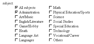
Solution:The solution is very easy. Simply put a line break tag right after the first FMP valuelist tag (see line 2 in the following). Also, insert a multiple columns tag before and after the entire FMP valuelist tags.
|
Now the checkbox list is very tidy.

Another way to overcome this problem is to create a customized list of radio buttons and checkboxes, then using the FMP-if tag to identify which option has been selected by the user (This tip is provided by Barnaby Wasson).
|
Problem 2:The value list for the radio buttons is short. However, I use abbreviations and thus the choices are too close to each other and users may be confused (see the figure below):

Solution:Again, the solution is easy. Put a spacer right after the first FMP valuelist tag as shown in the following code:
|
Now the radio buttons are visualy apart from each other and confusion is avoided.

FMP Tips Contents
|
|