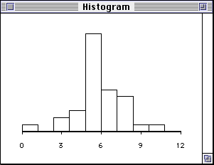
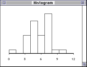
Bandwidth of HistogramChong Ho Yu, Ph.D., D. Phil. This program is for illustrating that the appearance of a histogram is a function of bandwidth/number of bin i.e. the appearance of the distribution (the top panel) changes when the number of bins (the lower left panel) change.
The following two histograms illustrate the same dataset. The first histogram uses 9 bins whereas the second one uses 10. Even though the number of bin increases by one only, the two graphs looks very different.
Note: There are formulas to compute the proper bandwidth and number of bins:
|