|
|
by Chong Ho (Alex) Yu, Ph.D. |
Problem
It is very common for a survey to contain questions that prompt respondents to check all options that apply. For example, in the following hypothetical survey developed for statistics professors, the first question is: "Which universities did you teach in the last ten years?" The given options are "Harvard," "Yale," "MIT," and "Other." The second question is: "Which statistical packages do you use on a daily basis?" The given choices are "SAS," "SPSS," "Splus," and "Other." In some survey engines, such as SurveyMonkey, item responses for "Check all that apply" are divided into separate fields, as shown in the following table. How can I present responses of A1-A4 in one single bar chart and that of A5-A8 in another chart?
| ID | Gender | A1 | A2 | A3 | A4 | A5 | A6 | A7 | A8 |
| Subject 1 | F | Harvard | Yale | MIT | SAS | SPSS | |||
| Subject 2 | F | Yale | |||||||
| Subject 3 | M | Harvard | Yale | MIT | SAS | SPSS | |||
| Subject 4 | M | Harvard | Splus | Other | |||||
| Subject 5 | M | MIT | Other | SPSS | |||||
| Subject 6 | M | Harvard | MIT | SAS | |||||
| Subject 7 | M | Yale | Other | SAS | SPSS | Splus | Other | ||
| Subject 8 | F | Yale | SAS | SPSS | Splus | ||||
| Subject 9 | F | Harvard | MIT | Other | SPSS | ||||
| Subject 10 | F | Yale | SAS | SPSS | Other | ||||
| Subject 11 | M | Harvard | MIT | Other | SPSS | ||||
| Subject 12 | F | Yale | SAS | Splus | |||||
| Subject 13 | F | SPSS | Splus | ||||||
| Subject 14 | M | Harvard | Yale | MIT | SAS | Other | |||
| Subject 15 | M | Harvard | SPSS | Splus | |||||
| Subject 16 | M | Yale | SAS | SPSS | |||||
| Subject 17 | M | Harvard | Yale | MIT | Other | SPSS | |||
| Subject 18 | M | Harvard | MIT | SAS | |||||
| Subject 19 | M | Harvard | MIT | SAS | |||||
| Subject 20 | F | Harvard | MIT | SAS | Splus | Other |
Solution
If there are only two questions using "check all that apply" in the survey, you can simply count the occurrence of the item responses in each column, write down the total numbers, and then create the bar chart using those numbers (or ask your graduate assistant to do it). But if you have 200 questions like this, automation is definitely a smarter way to go.
The automated process can be performed by three macros, which will be explained momentarily. An experienced SAS programmer can go even further to collapse the three steps into one. Nonetheless, I recommend making a logical break between tasks, because when something goes wrong, it is easier to find out where the bug is in partitioned code modules.
The first macros function is "count_check." As shown below, the comments in green should be self-explanatory. It is assumed that the survey data set has been loaded into a SAS dataset named "survey."
|
/* Create a macro function to count how many people check each option The function has two arguments: start item number, end item number */ %macro count_check(start, end); %DO i = &start %to &end; data temp; set survey; if A&i NE " " then count = 1; /* PROC SUMMARY gives the overall count and also the count by gender */ proc summary; class gender; var count; id A&i; output out=temp&i sum = Freq; /* To identify the option, create a new variable called "selection" To push the option "Other" to the bottom, add a space in front of the option values */ data temp&i; set temp&i; if A&i NE "Other" then selection = (" "||A&i); else selection = A&i; drop A&i; run; %END;
%mend
count_check; /* Invoke the function by starting from item A1 and end at item A4 */ %count_check(1, 4); |
The above procedure generates four temp files. In the first field entitled "Gender" the value for the first row is blank, because the first row is the frequency count of all subjects regardless of the gender. In PROC SUMMARY this type of summary is called "Type 0," which is indicated in the field "_TYPE_." The field "_FREQ_" shows the sample size whereas "Freq" indicates the number of respondents who checked the option.
The next two rows, which are "Type 1 summary," show the numbers partitioned by gender. It is important to note that in these tables percentage is omitted for a good reason. In this survey study there are totally 20 subjects, which are composed of 12 males and 8 females. It makes sense to say that 60% of the respondents are men whereas 40% are women. However, it is misleading to say X% taught at Harvard and Y% taught at Yale. It is because when subjects are allowed to check all that apply, responses are not mutually exclusive, of course, and thus the percentage will be over 100%.
|
Temp 1 |
Temp 2 |
||||||||||||||||||||||||||||||||||||||||
|
|
||||||||||||||||||||||||||||||||||||||||
|
Temp 3 |
Temp 4 |
||||||||||||||||||||||||||||||||||||||||
|
|
The second macros function is called merge_temp. Again, the comments in green should be self-explanatory.
|
/* Merge separate temp files of A1 to A4 into one file */ %macro merge_temp(start, end); data all; set %do i = &start %to &end; temp&i %end; ;run; %mend merge_temp; /* Invoke the function by starting from Temp1 and ending at Temp4 */ %merge_temp (1, 4); |
The above procedure simply appends all temp files into one file. Now you have a data set ready for SAS graphing.
| Gender | _TYPE_ | _FREQ_ |
Freq |
selection |
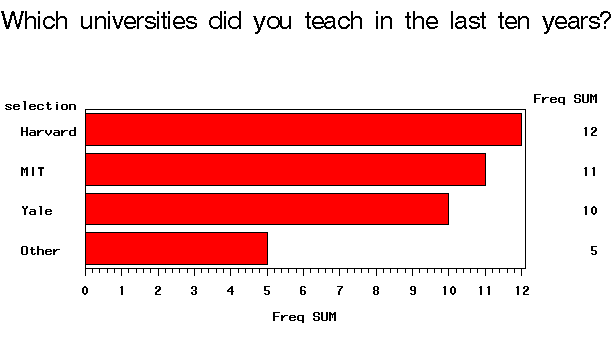
| 0 | 20 | 12 | Harvard | |
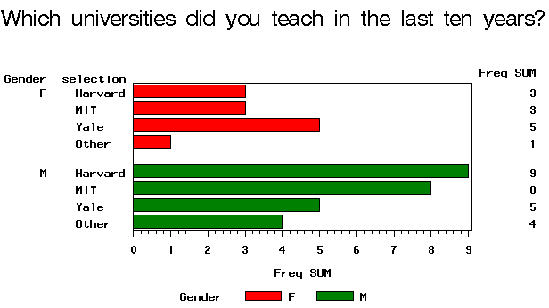
| F | 1 | 8 | 3 | Harvard |
| M | 1 | 12 | 9 | Harvard |
| 0 | 20 | 10 | Yale | |
| F | 1 | 8 | 5 | Yale |
| M | 1 | 12 | 5 | Yale |
| 0 | 20 | 11 | MIT | |
| F | 1 | 8 | 3 | MIT |
| M | 1 | 12 | 8 | MIT |
| 0 | 20 | 5 | Other | |
| F | 1 | 8 | 1 | Other |
| M | 1 | 12 | 4 | Other |
The last macros function is for graphing. The focus of this write-up is about automation rather than graphing. If you are unfamiliar with SAS/GRAPH and ODS, please consult a SAS manual.
|
/* Create a macros function to plot the graphics This function takes four arguments: 1. device e.g. activex, actximg, PNG 2. fileformat e.g. RTF, HTML 3. filename: Output file name e.g. A1_A4 4. title: Title in the graph, usually it is the question text */ %macro plot_select(device, fileformat, filename, title); goptions reset=all device=&device; ods &fileformat file="&filename..&fileformat" path="&path"(URL=none); /* Plot the overall count of each option regardless of gender */ data all2; set all; if _TYPE_ = 0; run; title "&title"; proc gchart data=all2; hbar selection /sumvar=freq; /* Plot the frequency count of each option by gender */ data all2; set all; if _TYPE_ = 1; run; proc gchart; hbar selection /sumvar=freq group=gender subgroup=gender; run; ods &fileformat close; quit; %mend plot_select;
/* Invoke the macros function, provide four agruments */ %plot_select (PNG, html, A1_A4, Which universities did you teach in the last ten years?);
|
The preceding procedure generates the following graphs:
 |
 |
It looks very complicated, doesn't it? How about the next question and all the rest in the survey data set? Will I go through the above steps over and over? No, I am very lazy. To plot item response from A5 to A8, I simply invoke the three macros functions as follows:
|
%count_check(5, 8); %merge_temp (5, 8); %plot_select (ACTXIMG, RTF, A5_A8, Which statistical packages do you use on a daily basis?); |
Please note that for A5-A8 I changed the device type from PNG to ActiveX Image (ACTXIMG), and changed the output file type from HTML to RTF. I can easily change these options without touching the original source code. Using this approach I can create 200 graphs in a short period of time, because copying, pasting, and editing are no longer necessary.
Navigation
Index
Simplified Navigation
Table of Contents
Search Engine
Contact