Color Regression
Lines
in
Data
Desk
|
|
Chong Ho Yu, Ph.D.
|

What is DataDesk?
DataDesk, developed by Paul Velleman in the 1980s, was a
pioneering tool for exploratory data analysis and
visualization. Its groundbreaking feature was the use of
dynamic, linked graphics that enabled users to
interactively explore their data. This innovation set
DataDesk apart from contemporary software packages like
SPSS. To grasp the concept of dynamic graphics, it's
helpful to contrast it with static graphics:
Static Graphics
- Graphs are not linked to other objects (e.g., data
tables)
- Output is fixed: what you see is what you get; you
can't click on data points for more information
Dynamic Graphics
- Graphical output is linked to all other objects
- Allows for real-time manipulation and exploration:
Facilitates rapid exploration of different data
views, pattern identification, and hypothesis
generation
Example: Color Regression in Dynamic
Visualization
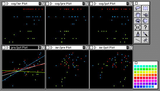
Color regression illustrates the power of dynamic data
visualization:
- Model: Four variables - posttest scores
(dependent), pretest scores, cognitive test scores,
and integration test scores (independent)
- Interactive color assignment: Observations are
grouped into four colors based on clustering
patterns
- Result: Four sub-models (represented by different
colored regression lines)
Key finding: The relationship between pretest and
posttest scores varies based on cognitive ability:
- Low cognitive ability: Negative relationship
- Medium or high cognitive ability: Positive
relationship
The Legacy of DataDesk
While DataDesk was discontinued on June 30, 2024, its
influence persists. Modern tools like JMP,
SAS Viya, and Tableau carry forward the tradition of
interactive, dynamic data visualization.
Conclusion
Data visualization remains a crucial component of data
science. The principles pioneered by DataDesk continue
to shape the field, emphasizing the importance of
interactive, exploratory approaches to data analysis.
Last updated: August 5, 2024
Navigation
Index
|