Chong Ho Yu, Ph.D. & Shawn Stockford
Arizona State University
Paper presented at the Joint Statistical Meeting, Altanta, GA (2001 August)
t is commonly believed that visualization tools can help researchers unveil hidden patterns and relationships among variables, and also can help teachers and speakers present abstract statistical concepts and complicated data structures in a concrete manner. However, higher-dimension visualization techniques (depicting more than three dimensions) can be confusing and even misleading, especially when human-instrument interface and cognitive issues are under-applied. Furthermore, statisticians, like other humans, are vulnerable to visual illusions when viewing statistical graphs (Wilkinson, 1993). Jacoby (1991, 1998) asserts that multiple-dimension is not a problem to mathematics, but remains a challenge to the school of data visualization. From the standpoint of human perception and understanding, the potentially extreme multi-dimensionality of multivariate data presents serious difficulties due to many cognitive limitations, and is what many call the "curse of dimensionality" (Bellman, 1961; Fox, 1997).
First, spatially speaking, humans live in a three-dimensional world. Four or more dimensions are out of the scope of our spatial perception. Second, traditional print media can depict two-dimensional graphs only. A so-called 3D graph that is rendered on paper through a two-dimensional window must involve nonlinear projection or spatial compression, either of which involves a certain degree of distortion, compromising the viewer's ability to accurately perceive the multivariate relationship therein (Wilkinson, 1999). With the advance of computer technology, the rendering of three-dimensional graphs, such as the spin plot, becomes more accessible than in the past. However, simultaneously viewing more than three variables is still a challenge. Nonetheless, researchers have been devoting tremendous efforts to go beyond three dimensions in an attempt to provide a tool that can capture rich associations among variables whose relationships are too complex to be considered with bivariate methods. This paper will present a taxonomy of high-dimensional data visualization techniques, and further, evaluate an example from each category (see Table 1).
Table 1. Taxonomy of higher-dimension visualization tools and examples evaluated
Spatial-oriented Temporal-oriented Data-driven
Splus2000's Trellis Conditioning plot
SAS/Insight's animated surface plot
Model-driven
SyStat's 3-D Triangular plot
Maple's animated 3D plot
In this study, attention is more focused on users' mental and behavioral processes during graph interpretation, rather than the rate of a successful outcome. That is, we are more interested in how users interact with these tools than whether they can arrive at the right answer. Findings and recommendations from this study are applied to the preceding categories of visualization tools, as well as specific software applications. The implications are concerned with two aspects-research and teaching/presentations. Findings based upon data-driven graphs are related to research whereas findings based upon model-driven plots are applied to teaching and presentations.
The data-driven vs. model-driven distinction is a simple concept and thus will be explained briefly. In data-driven graphics, raw data points make up the image in the graph's presentation space, whereas model-driven plots show a mathematical function only. The former approach is more appropriate at the early stage of data analysis. The latter approach is better-suited for teaching and presentation when patterns and relationships in one's data have been uncovered (Yu, 1994; Yu & Behrens, 1995). Some graphs depict both observations and a model, such as when a model is superimposed over raw data points. These graphs can be considered data-driven when the data points themselves determine the function shape, and/or when the fourth variable updates the points shown in the plot. Likewise, they can be considered model-driven when the mathematical function determines the shape of the surface, and when the fourth dimension informs the surface itself. In the next section, the features of Spatial-oriented and Temporal-oriented graphical displays will be discussed, and the example graphs will be introduced.
Spatial-oriented Multiple-symbol vs. multiple-view
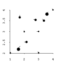
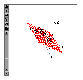
Before the introduction of high-powered computers, spatial-oriented approaches were the dominant paradigms for visualizing multivariate relationships. Spatial-oriented graphs are basically still graphs, in which all relevant information is displayed at the same time in a given space. Within this camp there are two sub-categories: Multiple-symbol and multiple-view. In the former, usually one display panel simultaneously shows values of multiple variables that are represented by different shapes, sizes, colors, and locations of symbols (Tukey & Tukey, 1988). For example, although a 2D scatterplot can display two variables only, the data points can appear in different size to depict the third variable. A "tail" can also be added to each data point, in which the value of the fourth dimension is indicated by the angle of the tail (Figure 4). Since the data points represented by complex symbols are called "glyphs," this type of display is termed as "glyph plot." Chernoff face (Chernoff, 1973) is another example of a multiple-symbol format. In a Chernoff face, multiple variables are represented by different facial features.However, the display can be very busy, and tends to overload the viewer. Moreover, the subjective assigning of facial features to variables has a marked effect on the eventual shape of the face, and thus the interpretation (du Toit, Steyn, & Stumpf, 1986). The shortcomings of Chernoff face are also applied to other types of graphs under the multiple-symbol paradigm.
Figure 1. Multiple-symbol display (glyph plot) that uses symbol size and "tail" angle variations
Multiple-view (Trellis) display
In the multiple-view paradigm, usually only one type of symbol is used but conditional relationships are portrayed in multiple panels, and thus it is so-called the multiple-view approach. One major challenge of multivariate visualization is to view all variables simultaneously but avoid cognitive overloading. And thus, some isolation of variables is essential. This mission is paradoxical but the multiple-view approach successfully adopts a strategy of "divide and conquer." In this paper discussion of spatial-oriented visualization is centered on this more promising paradigm.
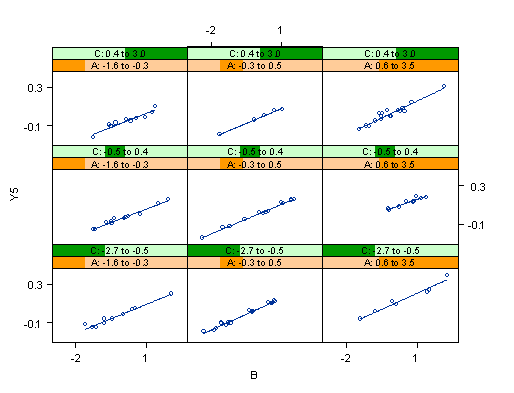
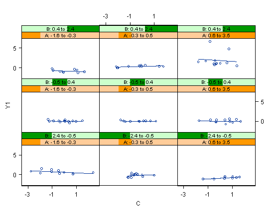
There are several types of multiple-view plots, such as, caseman displays, coplots, and Trellis displays. The Trellis display, which is available in Splus 2000 (MathSoft, 2001), is chosen to illustrate spatial-oriented/data-driven visualization (Becker, Cleveland, & Shyu, 1996; Clark, Cleveland, Denby, & Liu, 1999).At first glance, the Trellis display looks like a scatterplot matrix because both utilize multiple panels. However, a scatterplot matrix shows the relationships in a pairwise fashion while a Trellis display shows all relationships simultaneously. In a Trellis display (Figure 2), the vertical axis shows a dependent variable while the horizontal axis of each panel (view) shows a "panel variable." The variables appearing inside the "bars" of each panel are called "conditioning variables." For our example, the first panel of Figure 2 (lower left) shows the relationship (simple slope) between Y and B while the values of A and C are low. The second panel (bottom center) indicates the relationship between Y and B when the value of C is low and the value of A is medium. Relationships between Y and B at different levels of A and C can be examined by the multiple displays.
Using a movie as a metaphor, these multiple panels can be thought of as frames of a filmstrip. The slope of B against Y can be "animated" if the researcher stacks all panels together and flips them through quickly. In this example, since the slope of B against Y remains constant in all nine panels, the relationship between Y and B must be consistent across all levels of A and C. Thus, it is concluded that there is no interaction effect among A, B, and C. In addition, there are potentials for the Trellis display to expand its usefulness. Users can control the number of panels, and change the number, intervals and layout of the conditioning variables.
Figure 2. A Trellis display showing no interaction
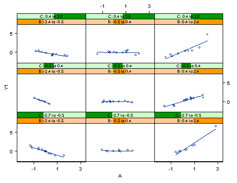
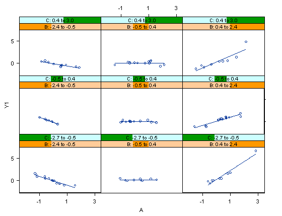
Figure 3 shows a different scenario. The relationship between Y and A appears to be consistent across different levels of C, but seems to vary across the changes in B. Thus, the Trellis plot suggests that there exists a 2-way interaction between A and B.
Figure 3. A Trellis display showing a 2-way interaction.
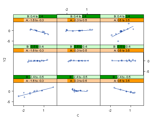
Following this strategy, a researcher could detect whether a 3-way interaction is present or not in Figure 4. In Figure 4 it is obvious that the relationship between Y and C is inconsistent across different levels of A, as well as different levels of B. Hence, a 3-way interaction is concluded.
Figure 4. A Trellis display showing a 3-way interaction.
In Wilkinson's (in press) view, the multiple panel approach is less prone to erroneous perception than the multiple symbol approach. Wilkinson uses the comparison between bar charts in multiple panels and bar charts using multiple symbols in fewer panels as an example. Wilkinson argues that in the latter although the collapsing of dimensions into fewer panels could save space, it introduces a symbol choice problem. It is difficult to find symbols that are easily distinguishable for more than a few categories. On the other hand, bar charts in separate panels, which are more similar to Trellis displays, convey a higher degree of clarity.
One drawback to the Trellis display is that the relationships depicted in each panel are bivariate. It does not give a wholistic sense of the multivariate relationship. We are not directly viewing the four-variable relationship in any one panel. This type of display requires viewing the combination of the bivariate plots to give the researcher a multivariate perspective. Also, some multivariate relationships can be "hidden" in the Trellis display. For example, a two-way interaction between B and C could be virtually invisible in a Trellis plot if the graph is created with the A variable on the abscissa and both conditioning variables specified as B and C (see figures x and x for illustration). Thus, the user of Trellis displays must have an exploratory mentality to exhaust all possible combinations of axis and conditioning panel allocation.
3D triangular plot
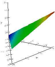
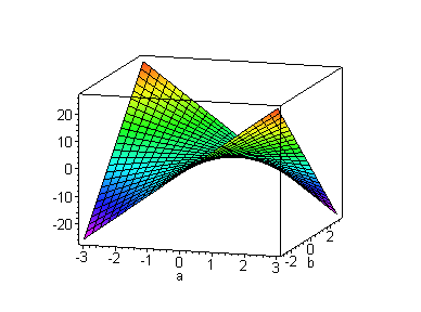
The three-dimensional triangular plot, which is available in SyStat (SPSS, Inc., 2001), is used as an example of a spatial-oriented/model-driven visualization tool. Unlike the Trellis plot, raw data points are hidden and only the function imposed on the data is shown in the 3D triangular plot (Figure 5). It is important to note that the axes in this type of plot are collapsed using triangular coordinates. In the graph, there are four dimensions--three variables are depicted in the triangular coordinates on the "floor" of the data space, while the Y variable is represented as a vertical axis as in the Cartesian (rectangular) coordinate system. Since this type of data space combines features of both triangular and Cartesian coordinate systems, it is also named 3D triangular/rectangular coordinate system (Wilkinson, 1999).
Triangular coordinates are also known as Barycentric coordinates, trilinear coordinates, and homogeneous coordinates. The technique was introduced by August Ferdinand Mobius in 1827 as a way to represent a point in the plane with respect to a given triangle. Although this new coordinate system was not appreciated at first, there are many interesting and useful applications (Dana-Picard, 2000; Diamond, 2001). Usually there are some constraints on the values of the three variables. Each variable can have a relative concentration between 0% and 100%. If A is at 100%, B and C must both be at 0%, and the point (100%, 0%, 0%) falls at one apex of the triangle. As you notice, the three axes of three variables in the SyStat's density plot do not range from zero to one. A conversion takes place in the program that allows the variables to be represented simultaneously in the same data space. This results in a data space that includes a limited range of values across the predictor variables. Depending on the complexity of the variable relationship, this restricted area of the data space can be a major drawback of using this coordinate system.
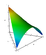
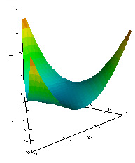
As in some other higher-dimensional graphs, in the density plot using barycentric coordinates, the presence or absence of interaction effects can be judged by seeing whether the mesh surface is flat or curved. In Figure 5, it is apparent that there is no interaction. Meanwhile, Figure 6 is the depiction of a 2-way interaction, while Figure 7 shows a 3-way interaction.
Figure 5. A 3D triangular plot showing no interaction.
Figure 6. A 3D triangular plot showing a 2-way interaction
Figure 7. A 3D triangular plot showing a 3-way interaction.
The 3D triangular plot possesses a unique feature that is not present in other visualization tools presented here. A 3D triangular plot can display all four dimensions at the same time in one view. In a Trellis display, the user must swap the variables across each axis panel to get a thorough view of the data. In Maple 3D animation and SAS/Insight, which will be introduced in the next section, the fourth dimension is hidden unless the user requests it. Nonetheless, this high degree of condensation of dimensions comes at the expense of clarity. Although this type of graph can clearly distinguish no interaction, and 3-way interactions, it may be problematic to illustrate 2-way interactions. To be specific, even if there exists only an A*B interaction, the graph also gives an illusion of an A*C interaction because the slope of B against Y and the slope of C against Y seem to be affected by A.
Temporal-oriented Temporal-oriented visualization is also called Kinematic displays (Tukey & Tukey, 1988). As the name implies, temporal-oriented visualization techniques utilize variations across time to depict higher dimensions. In other words, not all variables are shown within the given space and time. The user must play an animation module to unveil more information (Wainer & Velleman, 2001). The "time" dimension can be designated as a variable where the values of the variable are used to illustrate change.
Animated graph in SAS/Insight
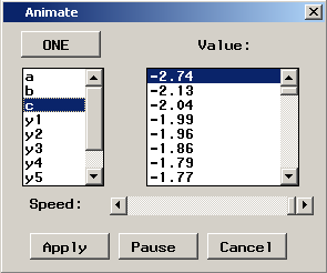
SAS/Insight's animated graph (SAS Institute, 2001) is one example of a temporal-oriented/data-driven plot. In SAS/Insight, the fourth dimension is introduced as a "time variable" (Figure 8). That is, the data points representing a three-variable relationship suspended in a three-dimensional space rendered on a computer screen are each highlighted as the values of a fourth variable are added sequentially from its lowest to highest value. To assist in the visualization process, SAS/Insight provides several different visual fitting methods allowing the researcher to examine the consistency between the data and a model, namely, a parametric surface of the researcher's choice (Figure 9a), a kernel density smoothing surface (Figure 9b), and a spline smoothing surface (Figure 9c). In the last two, there are slide bars for the user to change the bandwidth in order to adjust the level of smoothing. After the 3D plot is drawn, animation of the data points on the graph according to the value change of another variable gives the point cloud the appearance of points dancing about on the graph, allowing the researcher to detect patterns and structure in the multivariate relationship (Cheung, 2001).
Figure 8. The fourth variable as the temporal dimension
Figure 9a. Parametric surface
Figure 9b kernel density smoothing
Figure 9c Spline density smoothing
You can view a QuickTime movie showing how data points "dance" by stepping through the values of the fourth dimension (Please use QuickTime Player, Microsoft Windows Media Player cannot play the movie)
However, this approach has at least three limitations. First, in order to make the pattern amongst data points emerge, a large data set is desirable because patterns are clearer when the observations dance in clusters across a dense cloud of points. A small data set may show a scattering dance among sparse points, and thus may fail to reveal any pattern at all. At first glance, this notion seems contradictory with some experimental findings. For example, Kareev, Lieberman and Lev (1997) found that the use of small samples led to more accurate detection of correlation. However, this is true if only a pairwise relationship is displayed. Yu (1994) also found empirically that the efficacy of visualization tools is a function of both the sample size and the number of dimensions. A large amount of data necessitates feature-rich visualization tools, and multiple dimensions require more observations. Second, the function overlay has been generated according to the first three variables in the plot. Therefore, the addition of the fourth variable does not alter the existing function. Although the points are highlighted creating an illusion of movement, the surface remains static. A third, related limitation of the animated point cloud is that the addition of the animation variable to a 3-dimensional plot is not the same as viewing a four-variable relationship. The dancing effect of the animation has a different perceptual impact than that of the visual impression created from the pre-existing three-dimensional relationship. Further, it is the static visual associations that most people are accustomed to viewing and interpreting. Hence, the variable chosen as the animation variable may have unrevealed relationships with other variables involved.
Animated 3D plot in Maple
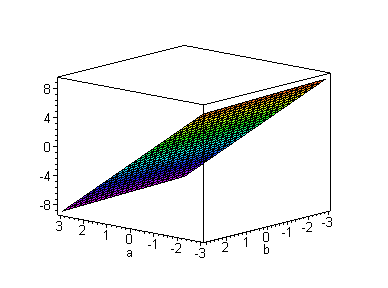
Maple offers an animated 3D plot procedure (Waterloo Maple, 2001), which is one example of a temporal-oriented/model-driven visualization tool. Like SAS/Insight, in Maple the fourth variable is cast into a "time" variable. After a 3D mesh surface plot is generated, the mesh surface can be animated according to the varying values of the fourth variable. But unlike SAS/Insight, the surface is re-fitted based upon the fourth dimension, and there are no data points shown in the graph. Actually, Maple is capable of superimposing data points on a smoothed function, resulting in a plot very similar to the SAS/Insight plot prior to its animation of points 1. However, the data points are fixed to the original three dimensions in the Maple plot. The observations are not animated or highlighted according to the fourth variable, and it is only the mathematical function that has been input with defined variable ranges (not specified values) that determines the motion of the surface, which represents the four-variable relationship. Therefore, Maple's animated 3D plot is classified under the temporal-oriented/model-driven category of higher-dimension plots.
In a typical 3D plot, the shape of the mesh surface determines the absence or presence of an interaction effect. A flat plane indicates the absence of an interaction effect while a warped surface is a sign of an interaction. In an animated 3D plot, even if the mesh surface is flat, one of the variables may still interact with the fourth variable when the slope changes according to the increment or decrement of the data value of the fourth variable (Figure 10).
Figure 10. Animated 3D plot showing a 2-way interaction.
You can press the stop button on the browser to stop the animation. To resume the animation, press the reload button. You can also view a QuickTime version of this animation.
When the mesh surface is curved, it is evident that there is a 2-way interaction. However, if the animated graph shows a moving mesh surface conditioning upon the fourth dimension, no doubt there is a 3-way interaction (Figure 11).
Figure 11. Animated 3D plot showing a 3-way interaction.
You can press the stop button on the browser to stop the animation. To resume the animation, press the reload button. You can also view a QuickTime version of this animation.
Other research using the geometric features of these displays includes Cleveland and McGill (1984), who argue that Trellis displays are better than surface plots in terms of interpretation error rates After they conducted a series of experiments on the efficacy of different graphical features, it was found that dots positioned along a common scale are the most salient features, while volume and color are more difficult to use as judgment factors. In this view, it may be predicted that Trellis displays are superior to function-driven plots because they use dots and each panel shares a common scale. Also, Wilkinson (1999) argues that although surface plots elicit a wholistic impression of a function, they are less useful for decoding individual values. On another occasion discussing surface plots, Wilkinson (1994) also points out that researchers can usually gain more information by displaying raw multivariate data directly, rather than by smoothing the trends in the swarm of observations. While we agree with Wilkinson's assessment to surface plots, Cleveland and McGill's assertion may be disputable. Our study will focus on viewers' interpretation processes, and the overall effectiveness of the different graph types identified above.
Method In order to study the efficacy of the preceding high-dimensional displays, subjects were exposed to these graphs with different scenarios. To generate different scenarios, a series of equivalent regression equations were developed that encompassed all possible 2-way interaction combinations among the 3 predictors labeled A, B and C (A*B, A*C and B*C), a 3-way interaction among all of the predictor variables, as well as a function that included the three predictors with no interaction. Coefficients that were not associated with the cross-product predictor of interest were intentionally given low values in order to create graphical images and patterns of data that clearly depicted the interaction that was sought. Intercepts were excluded from the functions. Table 2 shows the regression equations that were used to simulate the data and create the graphs.
Table 2. Functions used to create graphs and simulate data
Graph Shape
Regression equation
No interaction
Y = .05(A)-.1(B)+.025(C)
3-way interaction
Y = .05(A)-.1(B)+.025(C)+.01(A*B)+.011(A*C)-.011(B*C)+.96(A*B*C)
2-way (A*B)
Y = .05(A)-.1(B)+.025(C)+.96(A*B)
2-way (A*C)
Y = .05(A)-.1(B)+.025(C)+.96(A*C)
2-way (B*C)
Y = .05(A)-.1(B)+.025(C)+.96(B*C)
Model-driven graphs were created using the above functions in both the animate3d procedure in Maple version 6.0, and the Function plot application in SyStat version 10.0. For the data-driven graphs, a dataset was randomly generated using standard normal curve parameters for variables A, B and C. Five outcome variables were then generated using the same regression functions above. The data values for the three predictors and five outcome variables for each scenario were then rounded to allow for slight deviation from the models they were derived (R2 values ranged from .9896 to .9995). Data-driven plots were created using the Trellis display procedure in S-Plus 2000, and the fit procedure in SAS/insight.
Comparisons were made separately among the function-driven graphics produced by SyStat and Maple, and among the data-driven plots derived in SAS/Insight and S-Plus. In an attempt to establish equivalency among the sets of graphs across the graph types, graphs were created such that all possible variable combinations were represented for each model and for each program. For example, since the Maple graphs were 3-dimensional with the fourth variable added into the image as an animation variable, only two predictors could be represented on the predictor plane at one time. Therefore, three graphs were created for each outcome, one in which variables A and B were on the predictor plane, another with A and C, and a third with B and C. In each graph, the variable not represented on the predictor plane was the animation or conditioning variable.
Participants
Both student and faculty participants were asked to view the graphs voluntarily. Only students with at least 2 graduate level statistics courses, and faculty members who regularly conducted research and instructed statistics courses were invited to participate. Student participants included 1 female and 3 males, and ranged in age from 22 to 32 years old. Students had completed between 2 and 6 graduate level statistics courses. Faculty participants included 1 female and 1 male, and ranged in teaching experience from 5 years to 20 years.
Procedure Participants completed the tasks individually. Each was briefed of the project purpose, and asked four preliminary questions regarding their statistical background. Through immediate review of this questionnaire, it was ensured that participants had sufficient statistical knowledge and experience, and that they understood the concept of interactions in a ordinary least-squares (OLS) regression context. Next, they were oriented to the layout of graphical displays that they were asked to interpret, and provided detailed directions for using the graphical manipulation tools available in each program, which they were encouraged to use as much as they felt necessary. Graphs were prepared in advance and randomly chosen for presentation. To compensate for a carry-over effect, the order of the graph types was also randomized across participants.
The participants were instructed that they should allow as much time as needed, and they may use any combination of the graphs within a set to inform their decision. Each subject was asked to view sets of graphs from two programs, either the SAS/Insight and S-Plus plots (the two data-driven display types), or the SyStat and Maple images (the two model-driven display types). Participants completed one set of graphs before moving on to the next set, and they completed the sets of graphs within a program before being guided on to the next program by the observers. To account for fatigue and prevent participant apathy, observers would not allow any single graphical interpretation session to persist more than 90-minutes (although this constraint was not communicated to participants because an unforced response was most desired).
Quantitative measurements
Participants were asked to respond to the same multiple-choice question for each set of graphs corresponding to a particular outcome. The task expected them to decide whether the set of graphs represented a two-way interaction between A and B, a two-way interaction between A and C, a two-way interaction between B and C, a three-way interaction between A, B and C, or a regression among the three variables with no interaction. Upon making a choice and answering the subsequent open-ended interview question, the subject was presented with the next set of graphs. Correct decisions were counted and comparisons across graph types (within subjects) were made. Additionally, the time that participants took to interpret each set of graphs was recorded.
Qualitative measurements
We hesitated to do a mere performance comparison across graph types based upon group means. Instead of adopting a purely performance test-based approach, which may only tell us which group achieved a higher score, but cannot tell us why one treatment is superior to another, (Yu, 1999), we approach this problem in a qualitative fashion.
Upon choosing one of the five options, participants were asked in an interview format to describe the factors that lead to their decision. In addition to interpretation questions, participants were also asked to follow a "think aloud" protocol (Someren, Barnard, & Sandberg, 1994) while going through the interpretation process. In think aloud, the subject is expected to verbalize each thought he/she has while performing the interpretation tasks. The purpose was to attempt to flesh out barriers and misconceptions that graph users may encounter while viewing the images, and to attempt to identify potential differences in interpretation approaches that participants tend to implement from one graph type to another. Student participants were provided with a brief think aloud tutorial prior to the presentation of the graphs, while faculty participants were only asked if they understood the exercise. Observers developed journals for each participant, and data patterns among the different programs were analyzed after data collection.
Results Since the study is currently in its pilot stage, only preliminary results from a small selective sample are available, but nonetheless, are still enlightening. We classified the higher dimension plots by the degree of data reduction (data-driven vs. function-driven), and then by the degree of dimension reduction (spatial-oriented vs. temporal-oriented). Comparisons between the function-driven and data-driven plots did not seem appropriate since they have incompatible purposes. A function-driven plot is practically useless to the researcher (exploratory or not) who hopes to find meaningful patterns in his or her data. Plotting the function superimposed over the data points can clearly be beneficial to many people (and misleading to others), but a geometrical picture of the mathematical function alone does the researcher very little in the early stages of his or her regression analysis. Data-driven plots that show the observed relationship among the researchers' variables seem to be more appropriate when the objective is to explore and probe the data. A function plot becomes useful when the purpose is to display a complex relationship in a simple manner. For example, when one is instructing the concept of interactions in regression, a common way to graphically illustrate the interaction is through plots of simple slopes (somewhat similar to a crude Trellis display) along with an ANOVA relationship demonstration. However, this requires some cognitive resourcefulness for most novice learners as the simple slope plots depict relationships that appear bivariate but are actually multivariate.
Data-driven plots: Tools for data analysis
The SAS/Insight 3-Dimensional Animated plot and the S-Plus Trellis displays were compared for their overall user-interpretability and effectiveness, and for each, the processes used by participants were examined. Thus far in the pilot, four student participants and two faculty participants have viewed the data-driven plots. Next, we highlight some of the patterns that have emerged from the student and faculty pilot samples.
Trellis Display in S-Plus
None of the participants had previously been exposed to any graphical tools in S-Plus prior to this study. The training time varied from four to fifteen minutes, and the time spent on one set of graphs varied from five to twenty-one minutes. Different features of the Trellis display attracted different users. One experienced researcher said that the most salient feature of the plot was the set of slopes, but he was initially confused about how the slopes should be interpreted in this context. He was not sure whether the gradient of the slope or the direction of the slope should be used as a criterion for judging the presence of interactions. For example, if all conditioning panels showed positive regression slopes but the magnitude for the slopes were changing slightly across the panels, did it mean that the relationship between the predictor and the outcome variable was inconsistent across all levels of the conditioning variables, indicating an interaction? As an experienced researcher, he was clearly seeking more subtle patterns in the data than most novices. For most participants, the variations among the simple slopes were the central focus.
Another experienced researcher spent quite a long time (18 minutes) with the first set of Trellis plots. She expressed that initially she tried to relate the information shown on the 2D panels to a 3D rotating plot. This extra mental processing slowed down the task and lead to more confusion.
Another user initially paid a large portion of her attention to the conditioning panels, but neglected the relationship between the regressor and the dependent variables. For example, while attempting to identify a 2-way interaction between A and B, and when viewing variable A plotted against variable Y with variables B and C as the conditioning variables, she continually confused the implications of the conditioning variable values as being conditioned on each other rather than with the A-Y relationship. The result was an incorrect response of a B*C interaction.
The Trellis displays showed both the data points and simple OLS regression lines superimposed, but none of the users examined the residuals between the data and the linear least squares function. They assumed that the model was correct even though in some panels outliers were present. This leads one to believe that users may tend to focus attention on the superimposed function more than the data points themselves. It may also be explained by the hypothesis that since we only provided linear interaction options from which participants were expected to choose, they assumed that all relationships were linear.
Observation of the first user's behaviors while viewing the Trellis displays and SAS/Insight plots confirmed our belief that usage of visualization tools requires an exploratory spirit. With our initial design, only one view of the trellis display was shown for each set of relationships. Although we encouraged the user to swap the positions of the predictor and the conditioning variables, the user continued to use the default view. However, a single view of the dataset could be very misleading, as discussed earlier, because the relationship may be concealed due to the variable layout. Figure 12, which was seen by that user, did not show any relationships since all slopes were flat.
Figure 12. One view of Trellis display shows flat slopes across all levels of the conditioning variables
However, Figure 13 tells a different story when the A predictor became the regressor variable and B and C became the conditioning variables. It clearly showed that there was an interaction effect of A and B. Without exploring the data thoroughly, the user failed to unveil the interaction effect. The behavior of this participant lead to an alteration in the research design whereby all possible variable configurations were created to make up a set of graphs for any one outcome and any one program.
Figure 13. Another view of the Trellis display shows an A* B interaction effect
3D animation surface plot in SAS/Insight
The three-dimensional animated scatterplot in SAS/Insight was an example of a data-driven plot that simultaneously displayed the association among the first three variables, and the fourth variable was added to animate the plot. For the SAS/Insight module, both faculty participants reported having used the program extensively prior to the study for data analyses, but not as often for its graphical tools. Only one student participant had previously used the program, and she reported only limited exposure to its graphical tools. Probably due to the need for extra explanation of nonparametric model surfaces, the student participants took between eight and twenty-two minutes to be trained on the SAS/Insight module. Time taken to make a decision ranged from twelve to thirty-eight minutes.
A major disadvantage that appeared to affect this type of plot quickly surfaced during the pilot study. Since highlighting the points across the values of the animation variable represented the association of the fourth variable with the pre-existing three-way relationship, the fourth variable required a different perceptual operation than that which was used to interpret the initial three-way relationship. Evidently, this was cognitively demanding for participants since it seemed to require the viewer to simultaneously apply two distinct first-order factors of visual perception, a general visualization ability and spatial relations ability (see Carroll, 1993, for summaries of factor analytic studies in human perception). Additionally, given a continuous animation variable that included numerous values each highlighted individually, the viewer likely exceeded his or her short-term memory capacity prior to the completion of the animation effect and before any pattern recognition was possible. The existing relationship and the dancing of points that occurred in that relationship could appear vastly different depending on the variables chosen for the initial three-variable plot. As a result, participants' interpretation accuracy on the animated 3D plots in SAS/Insight was the poorer between the two types of data-driven graphs, especially with the three-way interaction graph.
Responses to interview questions and think-aloud procedures have thus far confirmed our hypotheses regarding viewer impediments to identifying the patterns in the SAS/Insight 3D animated plots. Some users explicitly expressed that they had difficulties with the hidden dimension (the fourth variable). For the SAS/Insight sets of graphs, both the parametric fit and the non-parametric fit plots showed three dimensions only, the display of the fourth dimension must be specially requested by the user. Obviously, this extra step hindered users from further exploration. In SAS/Insight, the user must go through a sequence of pull down menus, choose among several options in subsequent dialog windows, and make adjustments to the speed in order to view the animation in a useable manner. Additionally, the values of the animation variable are flashing in a separate window while the points are highlighted, which requires the rarely found ability of focusing one's visual attention on two distinct stimuli simultaneously. Thus, as with the Trellis plots, the accessibility and explorative ease issues were similarly problematic. The low visibility of the tool, in conjunction with the hidden dimension (the fourth variable), exacerbated the problem of ineffectively depicting the multivariate relationship. This tended to discourage many participants, leading them to "settle on" a less-informed decision.
Some users employed intuitive strategies to attempt to detect the interaction relationships. For instance, one user expected the regression mesh surface to update according to the fourth dimension, and tended to focus on the data point dance as it related to the pre-existing surface. The same user became further confused by viewing the point dance with various smoothing thresholds specified for the nonparametric surface in order to look for additional evidence of interactions. For most participants, the strategy of looking for relationships using the animation effect was abandoned, and they simply tried to interpret the static three-way relationships. This resulted in a high error rate particularly for the three-way interaction situation.
One experienced user was doubtful of the usefulness of the surface plot in SAS. He had difficulty manipulating the plot to his satisfaction, and becoming oriented with the 3D space. It might be due to the lack of color as a cue of depth. Also, the animation feature was not helpful for him to reach his conclusions. Indeed, he based his decisions on educated guesses informed by the static three-way relationships rather than the pattern of data "dance" representing the four-variable relationship.
To this point in the study, among the data-driven plots that were evaluated, the S-Plus Trellis display seems to be preferred by participants over the SAS/Insight 3D animation plot. The interpretation accuracy rate was also strikingly better with the Trellis plots (see table 3).
Table 3. Accuracy rates for pilot samples on the data-driven plots (percent of correct interpretations).
*Caution: small samples and pilot results only.
Graph Type
Student Sample (n=4)
Faculty Sample (n=2)
S-Plus Trellis Display (total)
10/12 (83%)
6/6 (100%)
No interaction
4/4 (100%)
2/2 (100%)
2-way interaction
3/4 (75%)
2/2 (100%)
3-way interaction
3/4 (75%)
2/2 (100%)
SAS/Insight 3D Animated Plot (total)
7/12 (58%)
4/5 (80%)
No interaction
3/4 (75%)
1/1 (100%)
2-way interaction
3/4 (75%)
2/2 (100%)
3-way interaction
1/4 (25%)
1/2 (50%)
Although each individual researcher may tend to find comfort in using predominantly a few particular types of display, these results suggest that those who are viewing raw multivariate data in an attempt to explore complex relationships among variables are more likely to uncover distinguishable patterns in a multi-panel, conditioning type display rather than a three-dimensional plot with animation that shows change among observations. Interview data further implies that researchers can benefit from using the breakdown method of detecting patterns. However, it is hypothesized that the animated plot may be more appropriate and useful when the researcher wishes to view the change in a relationship over time (when the fourth variable is literally time), or when the animation variable is a grouping variable. Improvements that were recommended from participants for the SAS/Insight module included issues of manipulation, and linking between the models and data points allowing synchronized animation effects between them.
Model-driven graphs: Presenting ideas clearly
The SyStat 3-dimensional triangular display and the Maple 3-dimensional animation graphs were compared for their overall user-interpretability and effectiveness, and for each, the processes used by participants were examined. For students, we sought a learner's perspective, and for faculty we wanted a teaching perspective. Three student participants and both faculty participants viewed the model-driven plots. The early trends emerging from the pilot samples will be discussed next.
3D Triangular plot in SyStat
No participants had previously been exposed to the 3D triangular/rectangular coordinate system used in the SyStat plots. Training for the tool was brief for both student and faculty participants (explanation time varied between two and eight minutes), which may have partially been a function of the limited user controls that are available for this graph. Interpretation time for one set of graphs ranged from six to twenty-two minutes. All users seemed to have difficulties interpreting the coordinate system in the 3D Triangular plot. Like other visualization tools, this type of graph allows the user to examine the plot from different perspectives with a rotation tool, but no other tools are available. . In this case, not only accessibility of manipulation tools is an issue, but also it seems that initial incomprehension discouraged users from further exploration.
Humans interpret unfamiliar things in terms of what we are familiar with. For example, while using SyStat 3D plot, some users attempted to view the 3D plot in a 2D fashion by rotating the graph to a perspective that isolates one particular variable. However, no matter how they rotated the graph, they failed to see something like a bivariate scatterplot and thus frustration set in. A similar strategy observed involved some users trying to track the change in the outcome as corresponding values of the predictor variables varied. For example, the user seemed to ask himself, "When A is low, B is low, and C is high, what is the value of Y?" However, applying the knowledge of Cartesian space into the triangular space resulted in confusion and frustration.
Although each of the few participants who have viewed the SyStat 3D triangular plot correctly identified the no interaction and 3-way interaction effects fairly easily, all of them were confused by the 2-way interaction display. We hypothesize that this may be due to a lack of experience with the triangular coordinate system. Additional participants are necessary to substantiate this claim.
3D animation plot in Maple
None of the participants had previously used or had exposure to the Maple program or graphics. Training time varied between five and twelve minutes. Interpretation time ranged from eight to twenty-seven minutes for one set of graphs. In spite of the widespread availability and application of 3D graphs, it seems that users were still more comfortable with using a 2D approach to interpret the 3D graphs. For example, although the Maple 3D animation plot shows a 3D surface, two users rotated the box to a perspective in which only two axes were seen. When the slope of one predictor against the outcome variable appeared linear and constant during the animation, they interpreted that there was no interaction. When they did not see a straight line but instead a warped surface or a shifting slope, they concluded that an interaction effect was present. While there was nothing wrong or improper in this approach, it is similar to a "divide and conquer" approach to understanding the relationship, and the same conclusions could have been reached using a 3D graph in a wholistic manner. Nevertheless, most users found the 3D animation plot helpful in seeing interaction effects.
The results of the Maple module further emphasized the notion that visualization tools require an exploratory attitude. It was found that the degree of the user exploration is strongly tied to the accessibility of the features. In the Maple graph, all manipulation tools are available by a right-mouse click and all movie control buttons are visible in the top bar. Users tended to fully use the animation features during the process.
One user found that actually she could reach the correct conclusion by looking at the series of static graphs alone. In Maple, the entire set of graphs was shown within a single screen. It was easier for the user to perform side-by-side comparisons. However, in other graphical systems where different plots were not presented simultaneously, it required users to switch from one window to the other. In this case, the user had to rely on his or her short-term memory for comparison.
One experienced researcher initially was confused by the color of the surface plot. He asked whether the variation of hues denote certain meanings. Just a moment later he found that the color is simply for enhancing the perception of depth. As mentioned before, in the multiple symbol paradigm, different features of the symbol such as size, shape, direction, and color indicate data values of different dimensions. It is understandable that the experienced researcher paid attention to the subtle aspects of visualization. However, this is not a piece of evidence to concur Cleveland and McGill's finding that color as a graphical element might leads to erroneous interpretation. Nevertheless, the confusion of that experienced user was temporary and this confusion did not hinder him from making the correct interpretation of the interaction effect.
Table 4. Accuracy rates for pilot samples on the model-driven graphs (percent of correct interpretations).
*Caution: small samples and pilot results only.
Graph Type
Student Sample (n=3)
Faculty Sample (n=2)
Maple 3D Animation Plot
8/9 (83%)
6/6 (100%)
No interaction
3/3 (100%)
2/2 (100%)
2-way interaction
2/3 (75%)
2/2 (100%)
3-way interaction
3/3 (100%)
2/2 (100%)
SyStat 3D Triangular Plot
6/9 (66%)
4/5 (80%)
No interaction
3/3 (100%)
1/1 (100%)
2-way interaction
0/3 (0%)
1/2 (50%)
3-way interaction
3/3 (100%)
2/2 (100%)
Discussion The accuracy with which learners identified the sets of graphs, and the qualitative data from all participants have lead us to hypothesize that for teaching and presentation purposes, the temporal-based displays, such as the 3D animation plot in Maple, seem to have advantages over the currently available spatial-based graphs, such as the 3D triangular coordinate plot in SyStat. It was apparent from the interview responses that most participants were more familiar with the Cartesian space and time than the Barycentric space, and thus comprehension of the latter requires much more mental processing (and figure manipulation controls, which seemed limited and cumbersome in the SyStat example). The Maple 3D animation plot, conversely, seemed to take linked displays to another level. The smooth motion of the animation along with mouse-based control of the rotation and easy access to other graph manipulations made the Maple graph appealing to most users. Further, it illustrated complex relationships among the four variables in a highly perceptible, wholistic manner.
Users who attempted to comprehend the graphs by rotating the plots into multiple 2D perspectives were easily misled by the triangular plot. While in Maple's 3D animation plot the information conveyed by the multiple 2D perspectives could easily be converted, users failed to do so in the triangular plot. Also, the high degree of accessibility of manipulation tools in Maple allows more active exploration. For these reasons, it appears that the Maple 3D animation plot is more helpful in illustrating concepts such as regression interactions to learners, and for presenting complex relationships than the SyStat 3D triangular plot.
For research purposes, the spatial-based graphs, such as Trellis displays in S-Plus, are preferable over the temporal-based displays, such as the 3D animated plot in SAS/Insight. The multiple-view strategy employed by Trellis displays allows users to "divide and conquer" the problem, allowing for the identification of complex relationships. Multiple dimensions are displayed yet the static graph allows users to examine the conditioning panels one by one, and without any single variable being at a disadvantage. The user is also easily able to keep track of the changing values of the conditioning variables. On the other hand, in SAS/Insight, the "dance" of data points representing the four-variable relationship can be difficult to follow, especially since the values of the conditioning variables are located in a separate panel. One must follow the pattern and the change in values simultaneously. As a result, the eyes necessarily miss a split second of the animation effect. Additional processing needed to perceive and concurrently interpret the parametric fit, and the spline surface tended to overwhelm users. Further, the variable chosen to represent the fourth dimension is not viewed in an equivalent, simultaneous manner with the first three variables in the data space, thus giving it a disadvantage.
We can not stress strongly enough that the results reported herein are interim results of a small sample pilot study, and should be viewed with appropriate caution. The pilot study has allowed us to identify numerous improvements in our research design, and several research questions to explore in the next phase. In addition, innovative ideas are accumulating for improvements that may enhance each of the higher-dimension displays we have evaluated. We are continually seeking alternative approaches to the graph types we have identified, and will include them in the comparison if possible.
References Becker, R. A., Cleveland, W. S., & Shyu, M. J. (1996).The visual design and control of Trellis Display. Journal of Computational and Statistical Graphics, 5, 123-155.
Bellman, R. E. (1961). Adaptive control processes. Princeton. NJ: Princeton University Press.
Carroll, J. (1993). Human cognitive abilities: A survey of factor-analytical studies. New York: Cambridge Univeristy Press.
Cheung, M. W. (2001 April). How to visualize the dance of the money bees using animated graphs in SAS/Insight. Paper presented at the Annual Meeting of SAS User Group International, Long Beach, CA.
Chernoff, H. (1973). The use of faces to represent points in k-dimensional space graphically. Journal of the American Statistical Association, 68, 361-368.
Clark, L. A., Cleveland, W. S., Denby, L., & Liu, C (1999). Competitive profiling displays: Multivariate graphs for customer satisfaction survey data. Marketing Research, 11, 25-33.
Cleveland, W. S., & McGill, R. (1984). Graphical perception: Theory, experimentation, and application to the development of graphical methods. Journal of the American Statistical Association, 79, 531-554.
Dana-Picard, T. (2000). Some applications of barycentric computations. International Journal of Mathematical Education in Science & Technology, 31, 293-309.
Diamond, W. (2001). Practical experiment designs for engineers and scientists. New York: Wiley.
Fox, J. (1997). Applied regression analysis, linear models, and related methods. Thousand Oaks, CA: Sage.
du Toit, S. H. C., Steyn, A. G. W. & Stumpf, R. H. (1986). Graphical exploratory data analysis. New York: Springer-Verlag.
MathSoft, Inc. (2001). Splus 2000 [Computer Software]. [On-line] Available URL: http://www.mathsoft.com
Jacoby, W. G. (1991). Data theory and dimensional analysis. Newbury Park, CA: Sage Publications.
Jacoby, W. G. (1998). Statistical graphs for visualizing multivariate data. Thousand Oaks: Sage Publications.
Kareev, Y., Lieberman, I., & Lev, M. (1997). Through a narrow window: Sample size and the perception of correction. Journal of Experimental Psychology, 126, 278-287.
SAS Inc. (2001). SAS/Insight [Computer software] [On-line] Available URL: http://www.sas.com
Someren, M. W., Barnard, Y. F., & Sandberg, J.A.C. (1994). The think aloud method : A practical guide to modelling cognitive processes. San Diego : Academic Press.
SPSS, Inc. (2001). SyStat [Computer software] [On-line] Available URL: http://www.spss.com
Tukey, P., & Tukey, J. (1988). Graphic display of data sets in 3 or more dimensions. In W. S. Cleveland (Ed.). The collected works of John Tukey: Volume V (pp. 189-288). Pacific Grove, CA: Wadsworth & Brooks.
Wainer, J., & Velleman, P. (2001). Statistical graphs: Mapping the pathways of science. Annual Review of Psychology, 52, 305-335.
Waterloo Maple. (2001). Maple. [Computer software]. [On-line] Available URL: http://www.maplesoft.com/
Wilkinson, L. (1993). Comments on W. S. Cleveland, a model for studying display methods of statistical graphs. Journal of Computational and Graphical Statistics, 2, 355-360.
Wilkinson, L. (1994). Less is more: Two- and three-dimensional graphs for data display. Behavior Research Methods, Instruments, & Computers, 26, 172-176.
Wilkinson, L. (1999). The grammar of graphics. New York: Springer.
Wilkinson, L. (in press). Presentation Graphics. International Encyclopedia of the Social and Behavioral Sciences.
Yu, C. H. (1994). The interaction of research goal, data type, and graphical format in multivariate visualization. Unpublished dissertation, Tempe, AZ: Arizona State University.
Yu, C. H. (1999). An Input-Process-Output Structural Framework for evaluating Web-based instruction. [On-line] Available URL: http://www.creative-wisdom.com/teaching/assessment/structural.html
Yu, C. H., & Behrens, J. T. (1995). Applications of scientific multivariate visualization to behavioral sciences. Behavior Research Methods, Instruments, and Computers, 2, 264-271.
Appendix
Code used to create Maple 3D animation plots (in Maple version 6.0)
3-way interaction
> with(plots):
animate3d(.05*a - .1*b + .025*c + .011*a*b + .011*a*c - .011*b*c + .96*a*b*c, a=-3..3,b=-3..3,c=-3..3);
A*B Interaction:
> with(plots):
animate3d(.05*a - .1*b + .025*c + .96*a*b, a=-3..3,b=-3..3,c=-3..3);
A*C Interaction:
> with(plots):
animate3d(.05*a - .1*b + .025*c + .96*a*c, a=-3..3,b=-3..3,c=-3..3);
B*C Interaction:
> with(plots):
animate3d(.05*a - .1*b + .025*c + .96*b*c, a=-3..3,b=-3..3,c=-3..3);
Procedure for creating SyStat triangular plots (SyStat version 10):
- Under the graph menu, choose function plot
- Type in model equation
- Under the coordinates option, choose triangular
- Other options can be chosen
- After graph is created, double-click to enter edit-mode
- Rotation tools are to the right
Procedure for creating 3D plots in SAS/Insight:
- Open the simulated dataset
- From the solutions menu, point to the analysis option, then choose Interactive Data Analysis
- Choose the active dataset from the work directory
- From the analyze menu, choose Fit (Y,X)
- In the dialog window, choose three variables to begin the display, two predictors (and their cross-product if you wish) should go in the X area, and the outcome variable should go in the Y area.
- Once the graph is created, choose Edit, Windows, then Animate
- Choose the predictor that is not in the current display as the animation variable
Procedure for creating S-Plus Trellis displays:
- Open the simulated dataset
- By pointing the arrow at the variable labels to choose them, hold down the ctrl key and choose the predictor that you want on the abscissa first and then the outcome variable of interest.
- Under the graph menu, choose 2D plot
- In the dialog window, choose a fit line if preferred (Other options can also be altered if you wish)
- After graph is created, align the graph window such that the variable labels in the data window is also visible.
- Press ctrl and highlight the remaining predictors
- By clicking once and holding in the shaded region, drag and drop the selection into the graph
Navigation
Simplified Navigation
Table of Contents
Search Engine
Contact Me